Evaluating classification models
Visualize the performance of your model
Encord Active enables you to inspect classification performance metrics such as Accuracy, Precision, Recall, and F1 scores as well as a confusion matrix. Performance metrics can also be inspected according to different class combinations. For this workflow, you need to import your model predictions into Encord Active.
Prerequisites: Dataset, Labels, Classification Predictions
Steps
- Navigate to the Model Quality > Metrics tab on the left sidebar.
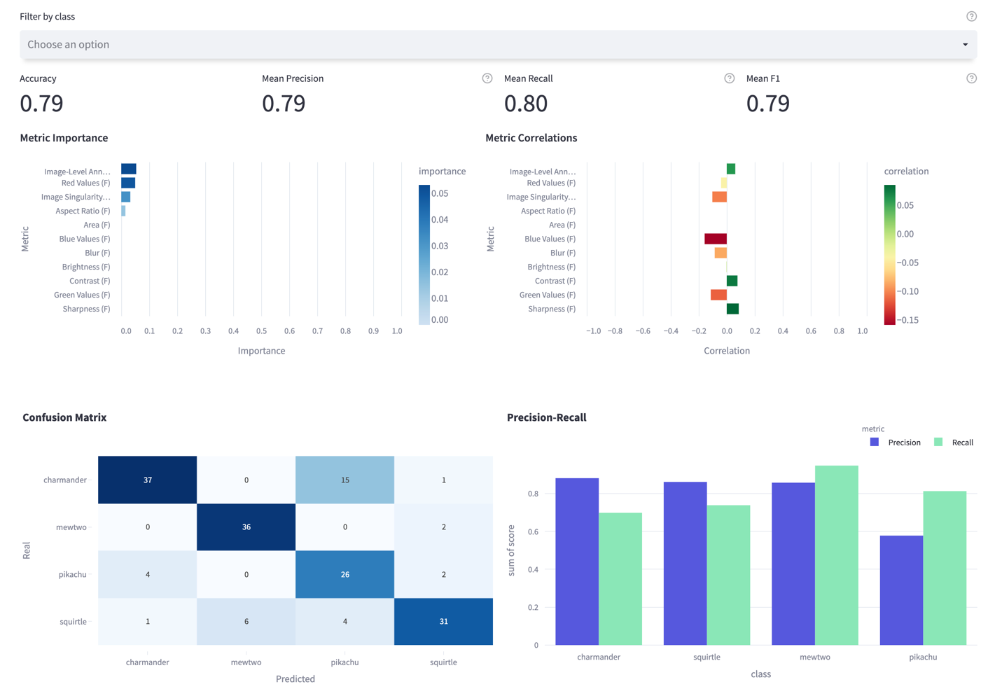
- Under the Classifications tab, you will see the main performance metrics (accuracy, mean precision, mean recall, and mean F1 scores), metric importance graphs, confusion matrix, and class-based precision and recall plot.
- You can filter by classes in the upper bar to see plots for your classes of interest.
- Via the confusion matrix, you can detect which classes are confused with each other (uni-directional or bi-directional).
- On the Precision-Recall plot, you can observe which classes the model has difficulty in and which classes it does well.
- According to insights you get here, you can, e.g., prioritize from which classes you need to collect more data.
Example
The following is the model performance result for a Pokemon dataset (classes: Charmander, Mewtwo, Pikachu, Squirtle)

Finding Important Metrics
The three important metrics for this dataset are Image-level Annotation Quality, Red Values, and Image Singularity. When we look at their correlation, we see that as the Image-Level Annotation Quality increases, model performance increases, too. On the other hand, Red Values and Image Singularity have a negative correlation with the model performance.
When we look at the confusion matrix, we find that most of the predictions are correct; Meanwhile, we can easily observe that a significant part of the charmander images was predicted as pikachu, resulting in low recall for the charmander and low precision for the pikachu classes. So there might be value in investigating these wrongly labeled charmander samples.
Performance by Metric
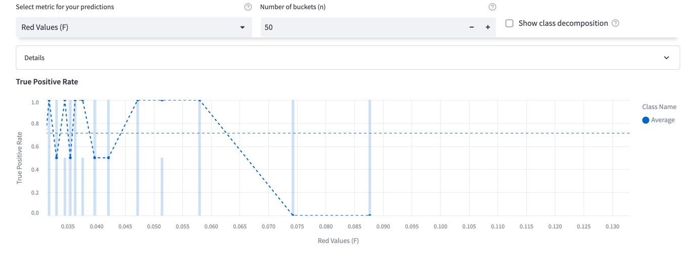
Now, choose Performance By Metric on the left sidebar. On this page, you can observe the True-Positive Rate as a function of the chosen metric. You can detect which regions model performs poorly or well, so that you can prioritize your next data collection and labeling work accordingly. Classes can be filtered via global top bar for class-specific visualization. From the image below, it can be seen that performance decreases when the image's redness property increases. So, we can find similar images, like the ones where the model is failing, and annotate more of them to boost the performance in this region.

Exploring the Individual Samples
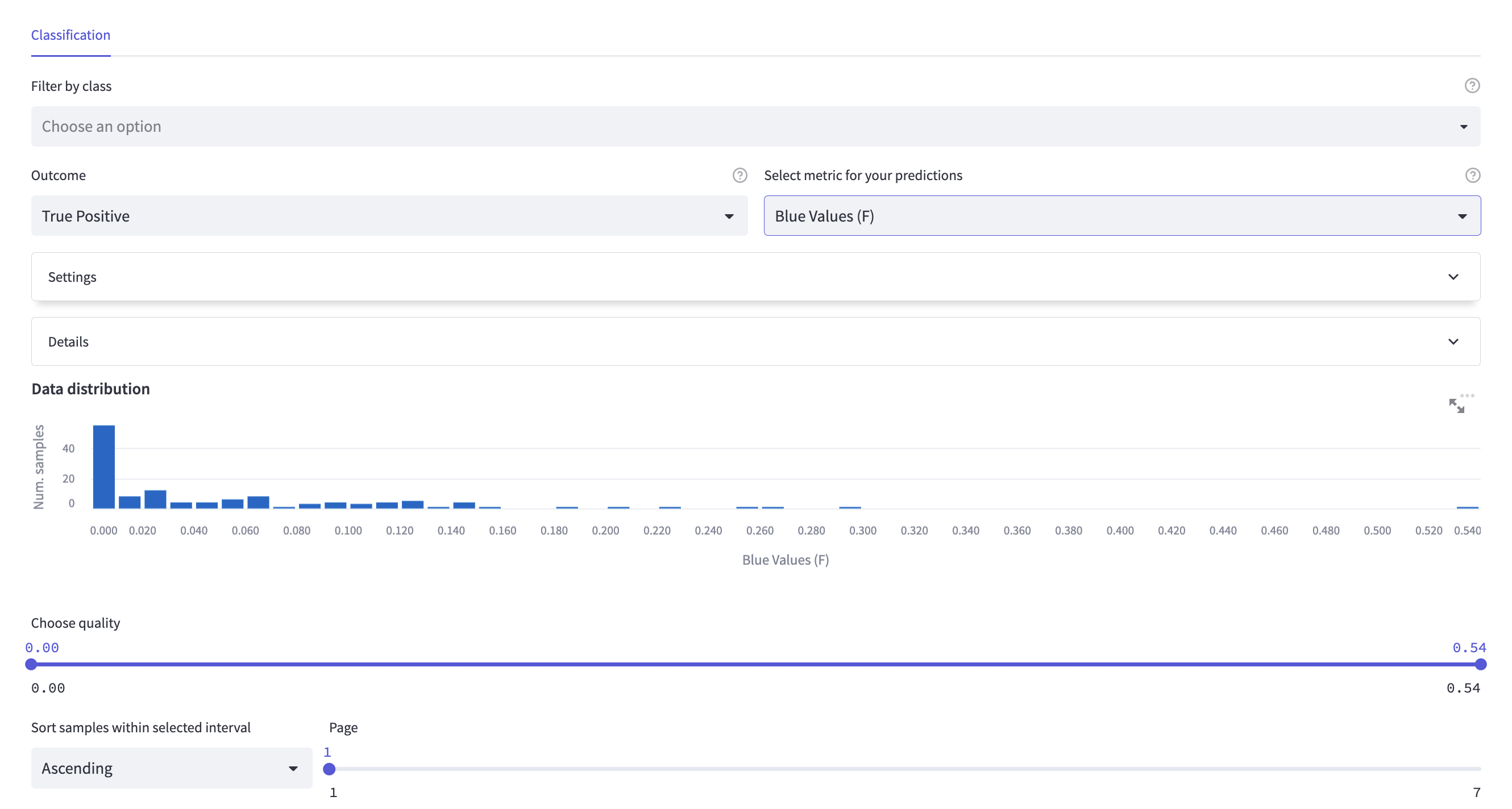
Using the explorer page, you can visualize the ranked images for specific outcomes (True Positives, False Positives).

This page is very similar to the other explorer pages under Data Quality and Label Quality tabs; however, since you have the prediction results now, the images can be filtered according to their outcome type. When the True Positive outcome is selected, only the images that are predicted correctly will be shown; likewise, when the False Positive outcome is selected, only the wrongly predicted images will be shown.
By inspecting False-Positive images, you can detect:
- where your model is failing.
- possible duplicate errors.