Exploring data distribution
Get insights into the distribution of your visual data with Encord Active
Encord Active enables you to visually explore your data and label distribution by pre-defined metrics, custom metrics, and label classes. Understanding your data distribution by different metrics helps you uncover areas where you might be missing data that could improve your models performance on different outliers or edge cases.
Setup
If you haven't installed Encord Active, visit installation. In this workflow we will be using the COCO validation dataset.
Data distribution
Steps
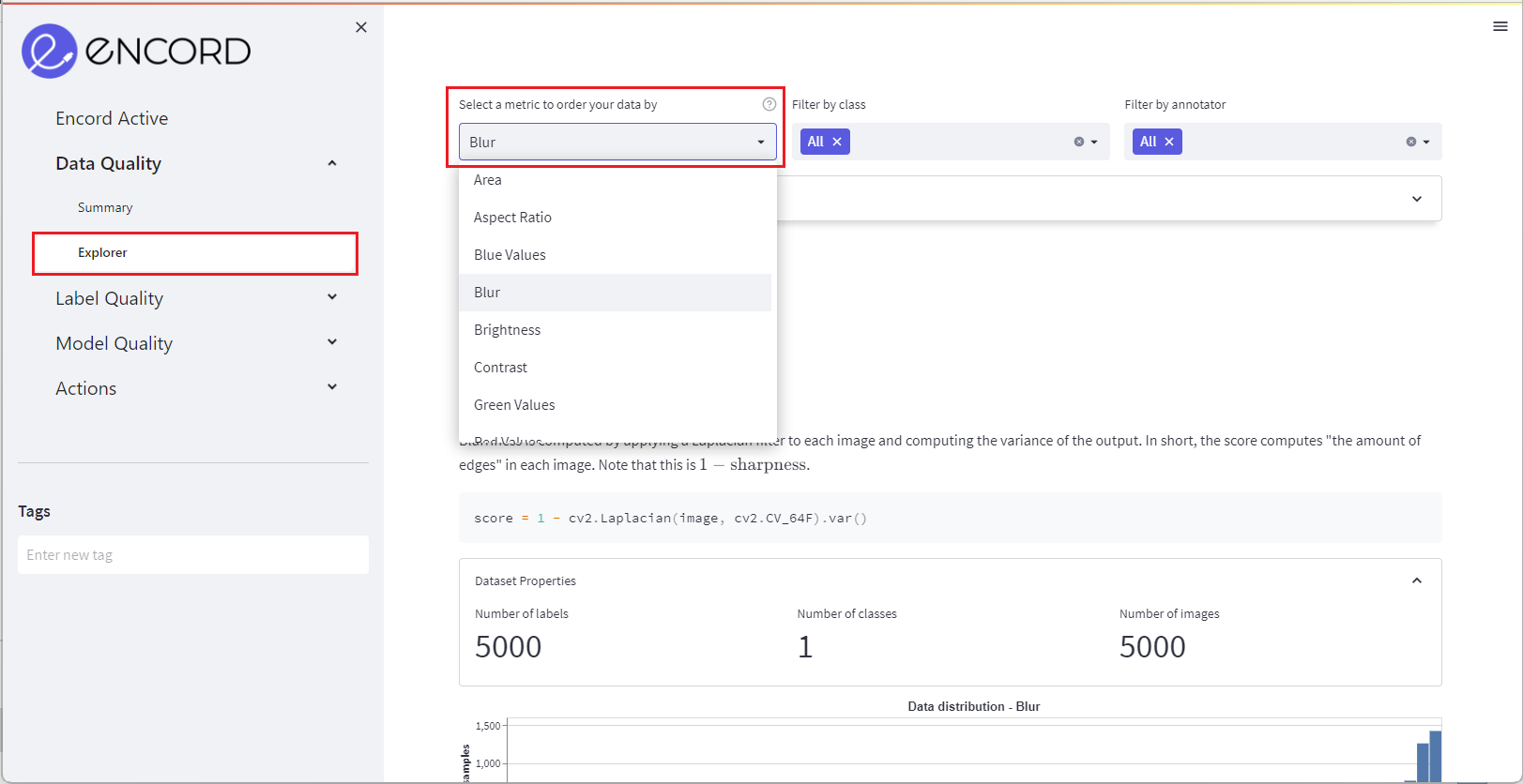
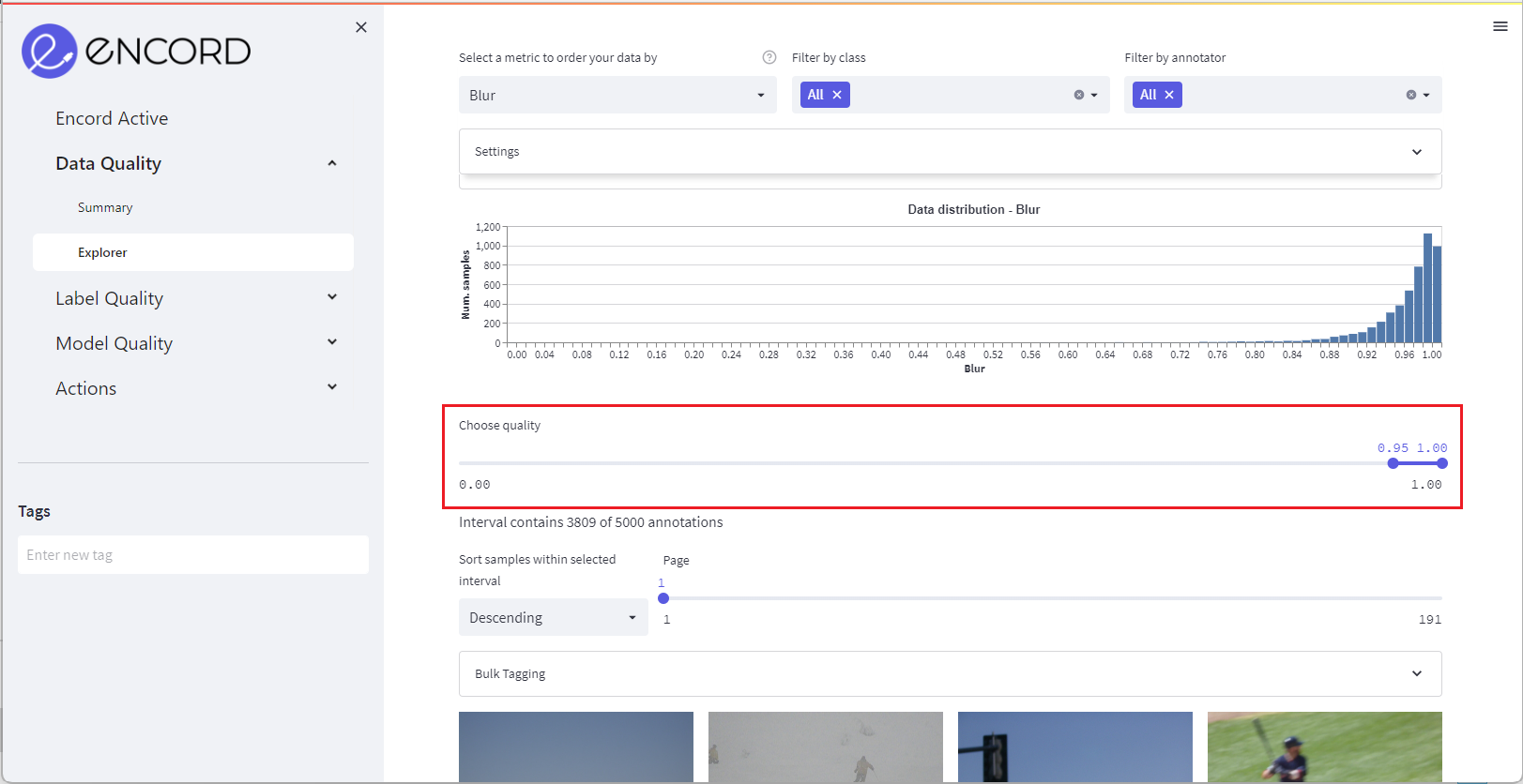
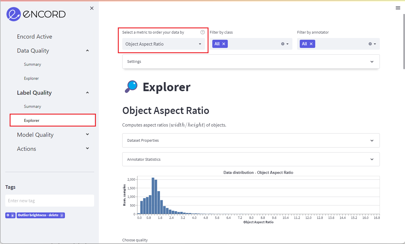
Navigate to the Data Quality > Explorer tab and select a quality metric in the top left menu to order your data by.
Select a metric to order your data by in the dropdown menu in the top of the page (e.g., Brightness or Aspect Ratio).
In the dashboard you can see the distribution of your data according to the chosen metric.
Use the slider to navigate the dataset ordered by the chosen metric.
Label distribution
Steps
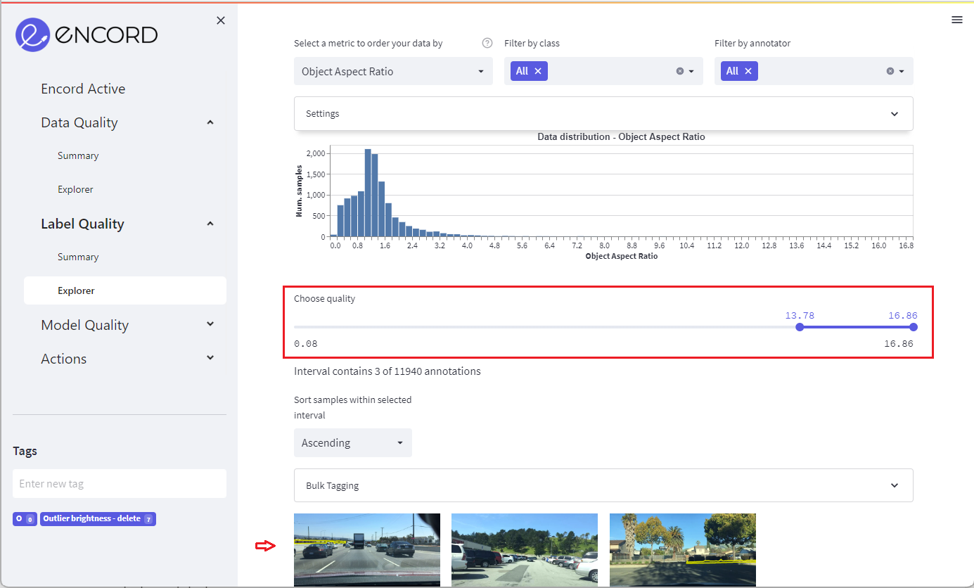
Navigate to the Label Quality > Explorer tab and select a metric in the top left menu to order your data by.
Select a metric to order your data by in the dropdown menu in the top of the page (e.g., annotation count or object size). [Optional] filter your data by class or by annotator using the middle and right dropdown menu.
You can use the dropdown menus to see your label distribution by class and annotator statistics.
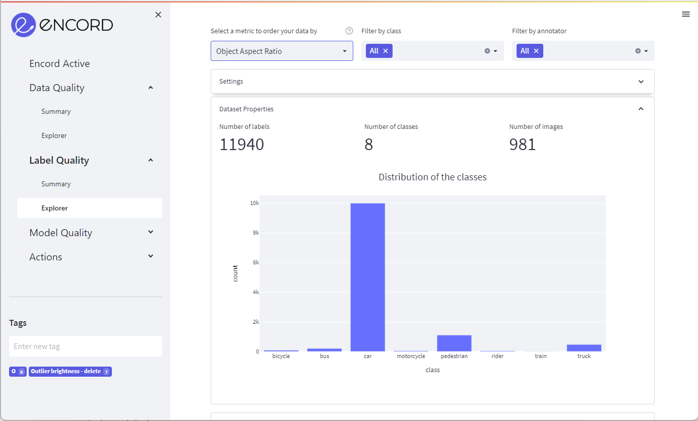
In the dashboard you can see the distribution of your data according to the chosen metric.
Use the slider to navigate the dataset ordered by the chosen metric.